ABOUT US
CI

Symbol mark
The image of a solid company was expressed centered on a dynamic circle that stretches out to the world, and in order to express the firmness and flexibility of the company at the same time, the gothic English alphabet was modified to make it look sophisticated.

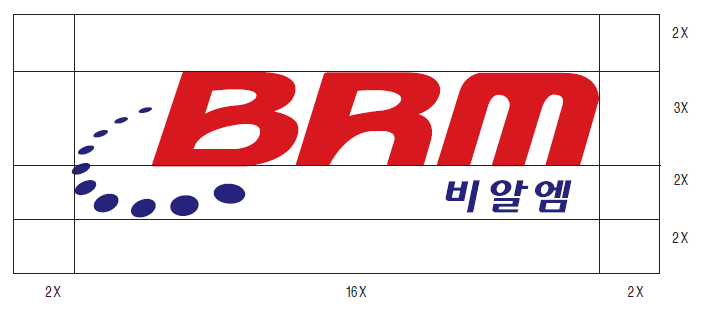
Signature Space Regulations
A logo is a symbol of all visual communication media that forms and delivers a corporate image, and when there are other design elements around it, the inherent image of uplift and flexibility is significantly impaired. Therefore, when using the logo, a certain space around it must be secured as a clear space. The following is the most ideal space regulation that can save the image of the logo in a general situation, so it should always be applied first, unless there is a special case.

Use of signature color
Although the color that symbolizes the company is an important factor in forming the corporate image, the colors listed in this section can be used flexibly according to the time period. The colors listed in this section are prepared for future use, so use them in consultation with the management department.

Spot and exclusive colors
BRM’s exclusive color is divided into main color and auxiliary color. The main color is mainly used as the color of the symbol mark, and the secondary color is a supplementary color to the main color. It induces a sense of unity of color by making it possible to represent a consistent image of the color system.
- Primary color

DIC Color Guide Majenta100% + Yellow 100%
- Secondary color

DIC Color Guide Cyan100% + Majenta100%+ Black 20%

